Questionnaire
For my research i have created a basic questionarrie. This is to collect an audiences opinion and to make sure that my music video is everything that my target audience want. I handed out a total of 80 questionnaries to people of all ages so i would be able to get a wider view of opinions.
This is a temple of my questionarries:
Music video survey for A2 MEDIA
1.What gender are you?
Male Female
2.How old are you?
11-16 16-18 18-21 2 1+
3.What type of music do you listen to?
Indie Pop Dance R’n’B Drum’n’Bass Other
4.Do you watch music videos?
Yes No Sometimes
5.How long should a music video be?
2 – 3 mins 3 – 4 mins 4-5 mins
6.Do you like to see the music video have a storyline?
Yes No
7.Do you like to see special effects in a music video?
Yes No
8.Do you like music videos to be realistic or unrealistic?
Realistic Unrealistic
9.What attracts you too a music video?
The artist Reviews the genre technical construction
10. What would you expect to see in a drum’n’bass video?
I have collected my data and made them into pie charts.
Question one, Gender.
i have worked out that 56% of the partcipants were female and the other 44% were male. I think this is a good percentage of results as it is will not be biased.
Question two, Age.
These are the perectanges of the age ranges in my research:
11-16 = 15%
16-18 = 36%
18-21 = 30%
21+ = 19%
The age group who most answered my questionnaire were the ages 16-21. This age group is my target audience.
Question three, Gerne.
These are the results from question three:
Indie = 12%
Pop = 33%
Dance = 10%
R’n’B = 14%
Drum’n’Bass = 22%
Other = 9%
Question four
The reason i asked this question was to see how the genreal public felt about music videos and how popular they are. These are the results:
Yes = 84%
No = 6%
Sometimes = 10%
Thses results show that music videos are popular and that it was a good choice to choose this project so i am very confident that this will be a success.
Question five
Asking this question helps me to indicate how long my music video should be.
2-3 mins - 59%
3-4 mins - 40%
4-5 mins - 1%
Question Six
This question shows me wheather or not to use a storyline in my video.
Yes - 36%
No - 64%
From these results i will not base my music video on a storyline.
Question Seven
Asking this question will show if i decide to use special effects when making my music video.
Yes - 75%
No - 25%
Due to these results i will try to use different special effects in my video.
Question Eight
These results for this question will determine the whole 'feeling' of my music video.
Realistic = 89%
Unrealistic = 11%
I will try to make my video as realistic as possible as the majority of people prefer realistic videos to un-realistic videos.
Question Nine
This question will help me with creating my digipak and magazine article as i can see what aspect of the video to present more than others.
The Artist - 20%
Reviews - 10%
The Genre - 67%
Technical construcution - 3%
The genre is the most important attraction to a music video according to my research.
Conclusion of results from my questionnaire.
From my results i now have a basic idea of my my music video is going to include. My music video is going to be between 2-3 minutes long and be as realistic as i can possibly make it. I will also try to uses special effects as much as i can and also try not to have a blatant story line. I am going to make this video to target my main audience, 16-21 year olds. I am going to make it urban and current just like the style of Chase and Status.
This music video has became iconic. This is the band Ok,Go who are an indie band from America. This video is so simple but yet so effective. For the whole of this four minute sequence the camera angle/shot does not change, it stays focused in a wide shot so it can show the whole of the band members and the treadmills they are performing on.
The choreography is this video is essential as if it weren't for this then the whole video would be pointless. The choreography creates a sense of humor to the video and also incites us, the audience, to carry on watching.
High key lighting is used through out the video because it allows the audience to see every movement which is made, facial expressions and there clothing.
There is not a lot that i can comment on in the video as it is so simple.
Digipak Analysis
Florence And The Machine - Lungs
A digipack is vital for a marketing strategy. This digipack is promoting not only the album, it also promotes the song and the music video as using the artistic work it all relates to each other. The mid shot of Florence on the front cover shows clearly the use of iconic image of herself surrounded by the natural/flowery background, and her costume shows the genre of the album which is Indie. The repetion of the image of Lungs not only on the front cover but the back shows the emphasize of the iconic imagery that they used to promote the album. The font that they've used is a san serif font to convey a classic look which is depicted through the way the background colour is black and the fonts are white along with the picture of the lungs and the other informations available.
A similar imagery is used in the music video "Rabbit Heart"
And this also ties in with the artist's myspace page
and the official website
the recurring image of the lungs and the font used for "Florence + the Machine" is seen all over on their websites, video, and album. This shows the emphasize of using iconic imagery for their marketing strategy.
Magazine cover analysis
This is a music magazine called 'VIBE'. This is a monthly magazine which is sold all over the country in places such as supermarkets, music stores, newsagents etc.
The first thing we see is the cover model, Kanye West. He is staring directly down the camera lens to create intensity for the consumer. Also this is a mid-close up which allows the audience to see his facial expression in great detail and to also recognise who it is.
All of the subheadings and page splashes all keep with the same colour theme, pink and blue, this is to make the cover look familiar and it also incorporated with the cover stars oufit by highlighting the blue collar of the models jacket. The magazine title is the largest piece of text to show it's importance over the other subheadings. This is an example of an information hierarchy. We then see the cover story,' KANYE WEST I AM RAP', Is the second largest piece of text on the cover which again shows a form of information hierarchy.
Chase and Status are a British D.J duo who have taken the recent charts by storm. Their distinctive, creative and heavy sound is iconic. Chase and Status have been raved about by music stars such as: Jay-Z, Plan B, Lily Allen, Pharrell Williams, Kano, N-Type, Skream and White Lies. They're music is an inspiration to the 'raving' generation. Their musical composition is truly mind blowing in my opinion. They're music and music videos are aimed at an age range of around 15+.
They signed a major publishing deal with Universal Publishing, One of the most prestige publishing companies in the world, in May 2009. They have collaborated with multi-platinum stars to create songs which have changed an entire generation.
Music video anaylsis
Their music videos, which are created and produced by themselves, all follow the same themes. The themes of their videos are quite urban and aimed at the teenage generation which appeals to their target audience. For example, This is from their newest and most successful album, 'No More Idols', which held the number one album in the UK for three weeks running. The single 'End Credits' featuring Plan B was asked to be the theme song for the recent blockbuster hit, Harry Brown.
This video follows a young man, Plan B, who looks like he is involved with gang crime. His choice of costume, a dull tracksuit with a hood, tells us that he is a typical young adult who may be involved with crime as his hood it placed over his head with a stern look on his face. It follows his journey as his life flashes before his eyes.
The first scene that we see is in slow motion and is lit with low key lighting. Slow motion allows us to pay attention to the detail of what is happening and allows the audience, to understand what is happening. Using a wide shot/establishing shot to see his whole body and set the scene so the audience has an understanding of the characters surroundings, we see our main character, Plan B,falling onto his back in slow motion for 0:17 seconds.The sequence then jump cuts to a close up of his face,still in slow motion for the audience to realise what's happening and to be able to recoginise his face, until 0:27. This is to show the emotions/reactions of the characters face. The lighting arrangement has also changed from low-key to high-key lighting, this is to able the audience to see everything in the shot and to make his facial expressions the main focus.
The camera shot then switches to a close up bird’s eye view of the characters face as he starts to sing. This is to show the audience a full facial view of our character as we have not seen one yet. High key lighting helps us, the audience, to see the expression on his face. He looks worried and scared as he appears to be levitating upwards towards the camera. This is to show that he has died and soul is levitating out of his body.
Then there are a series of insert cuts, which last for four seconds, which consists of different scenes of violence and memories of our main character. By inserting these cuts, we the audience, are constructing a story in our heads of what this man is like and why he is in the situation that he is in.
It then cuts to a new scene where we see our character sitting at a table with three new actors.
The contrast in costuming between the main character and these newly introduced actors is essential for the audience. The main character, which we have seen just in tracksuits, stands out against these three characters that are all dressed very consecutively and smart. This shows that there importance and that they are serious people. The set design of this shot shows all four characters sitting around a table which has been lit with high key lighting on purpose so that the audience can see what each character is wearing and that there are papers on the desk. Designing the set and using lighting in this way influences the story in which the audience are creating by how they relate to scenes that they see like this is in television shows like 'The Bill', 'C.S.I' etc. Also while this is taking place on the left-hand side of the room, the audience then see what appears to be the main character's ghost on the right-hand side singing as if he is singing towards the scene on the left-hand side. This affects the audience’s story by them believing that he actually dead.
It then cuts into a reaction shot to see the main characters face. He then smiles at them with a smug look on his face. High key lighting is used again to show that his facial expression so the audience can see that he doesn’t care what these people are saying to him. It then cuts to a shot-reverse-shot, first of Plan B then of the two actors across the table from him, then back to Plan B. This editing cut has been used as it allows the audience to see the characters speaking to each other and it makes them also feel like they are there. We see a mid-close up of the two people opposite the desk and we, the audience, can confirm that they must be some sort of detectives by the clothes they are wearing and also the fact that they have badges on. We also finally see they're facial expressions by the high key lighting. We can see by their expressions that they are not impressed with what the main character has been saying to them and they look stern. Still using the shot-reverse-shot cut, we finally cut back to Plan B. For the first time in this music video we hear diegetic sound. This two second clip is taken from the film 'Harry Brown' which shows Plan B telling the two detectives...'F*** you!'. By including this sequence in the music video it shows the audience the main characters attitude and they make their own judgement on his situation.
An insert cut then shows us,which appears to be a hand held video of someone running while recording themselves. This was inserted in this particular slot to break up the scene before and for it to contrast with the next scene.We then go back to Plan B in a close-up as he is still rising towards the camera as he was at the start of the music video.
An insert cut is then takes us to a leading look camera movement added in from the film 'Harry Brown' again, which is shot in low key light, of a group of youths beating someone up.
A leading look camera movement is when you see as if you was looking through the characters eyes. Using this method tries to make the audience feel that they were watching what was happening which makes it feel realistic. Low key lighting was used to try to make the audience feel like this is realistic and they could imagine watching this from through their own window. This scene also tells the audience what type of area this is by how no one comes out to stop this fight so therefore it must be a regulaur occurance. There is the around seven insert cuts of different scenes which the audience have already seen. Doing this adds an increased editing pace which creates a sense of speed that audience will be able to follow.
Then the continuous close up of Plan B levitating towards the camera is cut in and ends that sequence. This scene keeps getting replayed so that the audience can familiarise themselves with the main character which is Plan B.
Magazine cover analysis
ATM is a monthly music magazine who's target audience are 16- mid-20 year olds. The Masthead is the identification of the magazine which the font very changes so it is recognisable to it's subscribers. The colour of the masthead is a bold colour which has been used to stand out against the dull grey background but also it is the same colour as the cover line (chase and status) so that it shows a colour scheme which looks appealing to the audience. The cover line is the second largest piece of text to show it's importance over the other subheadings. This is an example of an informationhierarchy.
In print the cover image has a bleed which allows for a margin of error when cutting. In the cover image we see our cover stars, Chase and Status, dressed in casual clothing which quite stern looks on their faces but they are looking directly down the camera which creates intimacy and is eye-catching for the consumer.
The subheadings are placed in a much smaller font near the price to catch peoples eye and to attract their target audience witch the articles featured in the magazine.
The splash this page is shaped as a cd which links in with the general genre of the magazine. It is also the same colour as the masthead and cover line which makes it standout.
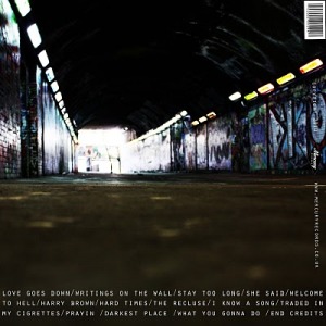
Digipak Anaylsis
Chase and status have an urban look to all of their videos and album covers. As they're music genre is drum 'n' bass mixed in with dubstep i expected a quite urban digipak to follow trend and to relate to their music. The colours used are very dark but with strong bold colours for the grafitti, which captivates their main focus audience, teenagers.
I have decieded to use Blogger as a web diary to record all my progress through my A2 Media project.
I have created a time plan for my research and planning coursework so that i can mange my time well and hopefully complete it all to the best of my ability within the deadline.
DATES FOR COMPLETION
COURSEWORK CHECK LIST
12th September 2011 to 1st October 2011
Analysis’
1.Choose band/singer on a genre which I want to influence my work
2.Analyse their music video, digipak and a magazine cover
3.Analyse two other music videos
4.Analyse a random digipak
5.Analyse a random magazine cover
6.Secondary research
7.Research Steve Nield and Simon Firth
8.Key statistics to show I’ve looked at Demographics
1TH October 2011 – 6th October 2011
Research and planning
1.Questionnaire about music videos and get responses
2.Record a market research session on what people really want
3.Questionnaire on what magazine covers and digipak should be like
4.Total up all information and analyse
6rd October 2011 – 10th October 2011
New media being used
1.Use Facebook to get details and screen grabs
2.Use Photoshop to edit a picture and take screen grabs to show the transition
3.Take a picture of my equipment
4.Write about the equipment used, SONY A1E. Describe and show how it used it